Clayton Release Day!
It’s been more than a year since my last pattern release, so you can believe me when I say I’m so very excited to introduce the latest in my collection of beginner-friendly patterns, the Clayton quilt! This modern-traditional design is tailor made for solids and small-scale prints and goes together in a flash!
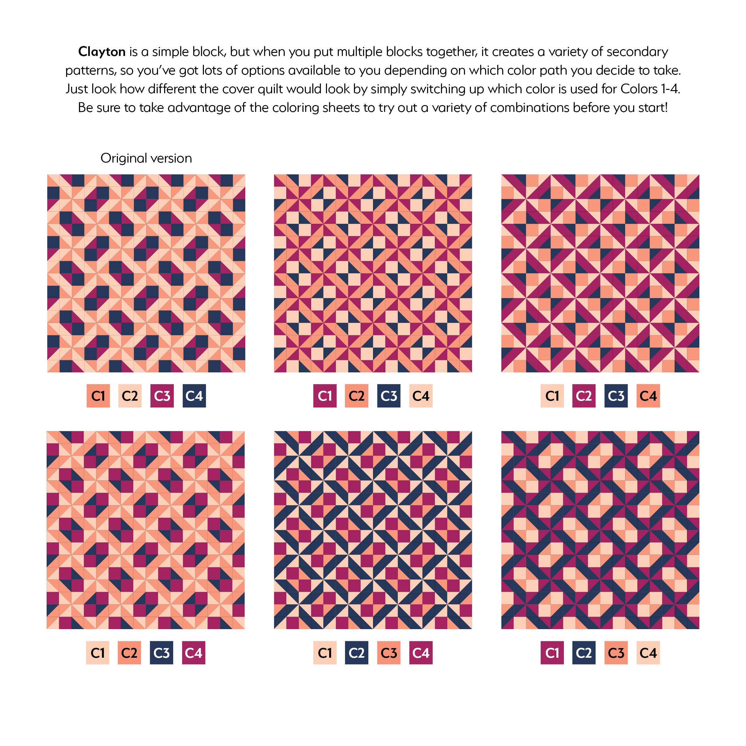
Clayton is a modern-traditional design inspired by the traditional Clay’s Choice block. Originally created as part of the Quilt Block Remix Challenge, I took the original block and added half-square triangles, then swapped the solid squares around to create a whole new look.
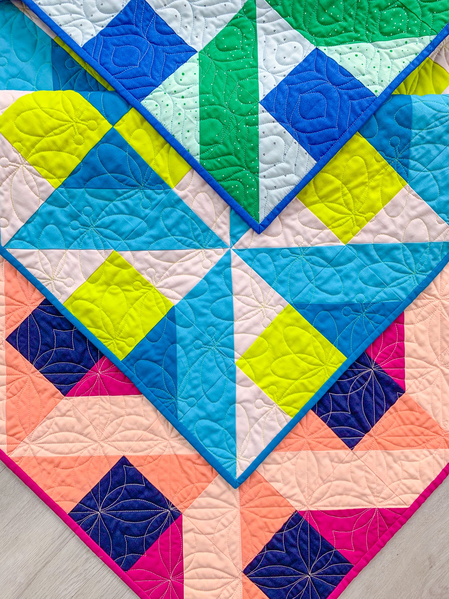
What’s especially fun about this pattern is how different it can look depending on the placement of your fabrics. As you can see in the mock-ups below, the design looks completely different when you switch up the placement of Colors 1-4. The pattern includes coloring sheets for every size, so you can try out lots of color versions before committing. And speaking of sizes, Clayton includes a whopping SIX options from King to Baby!
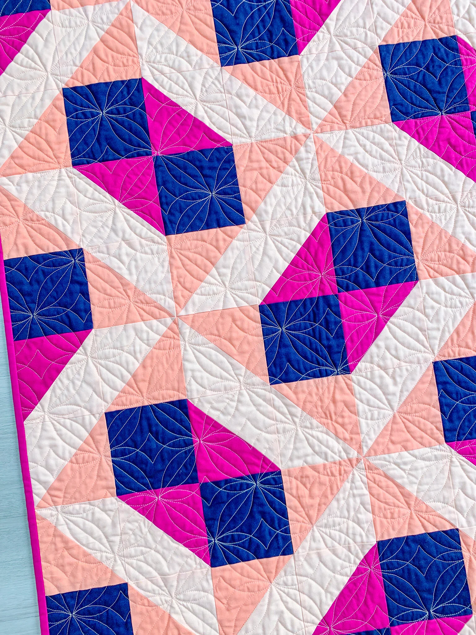
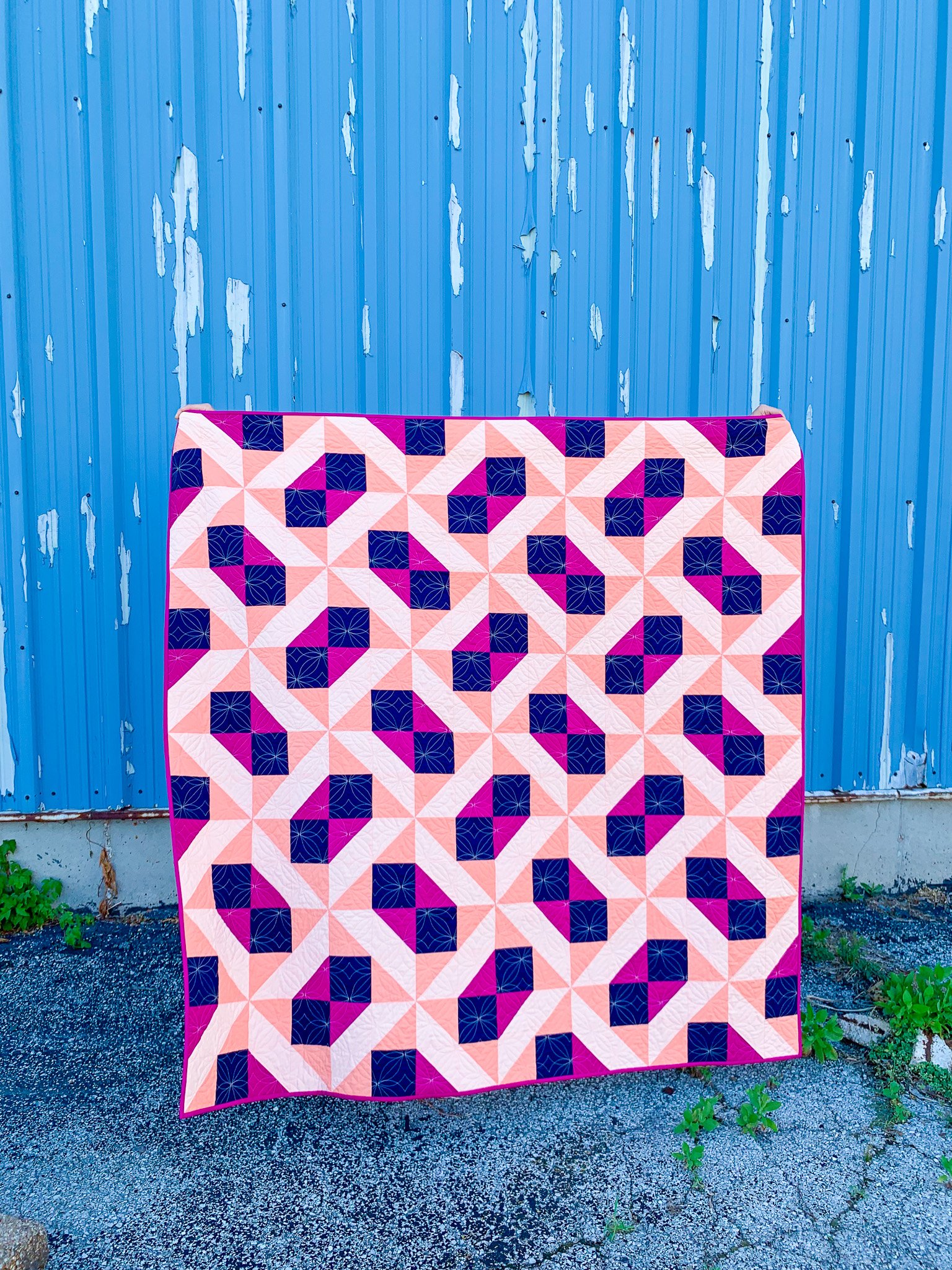
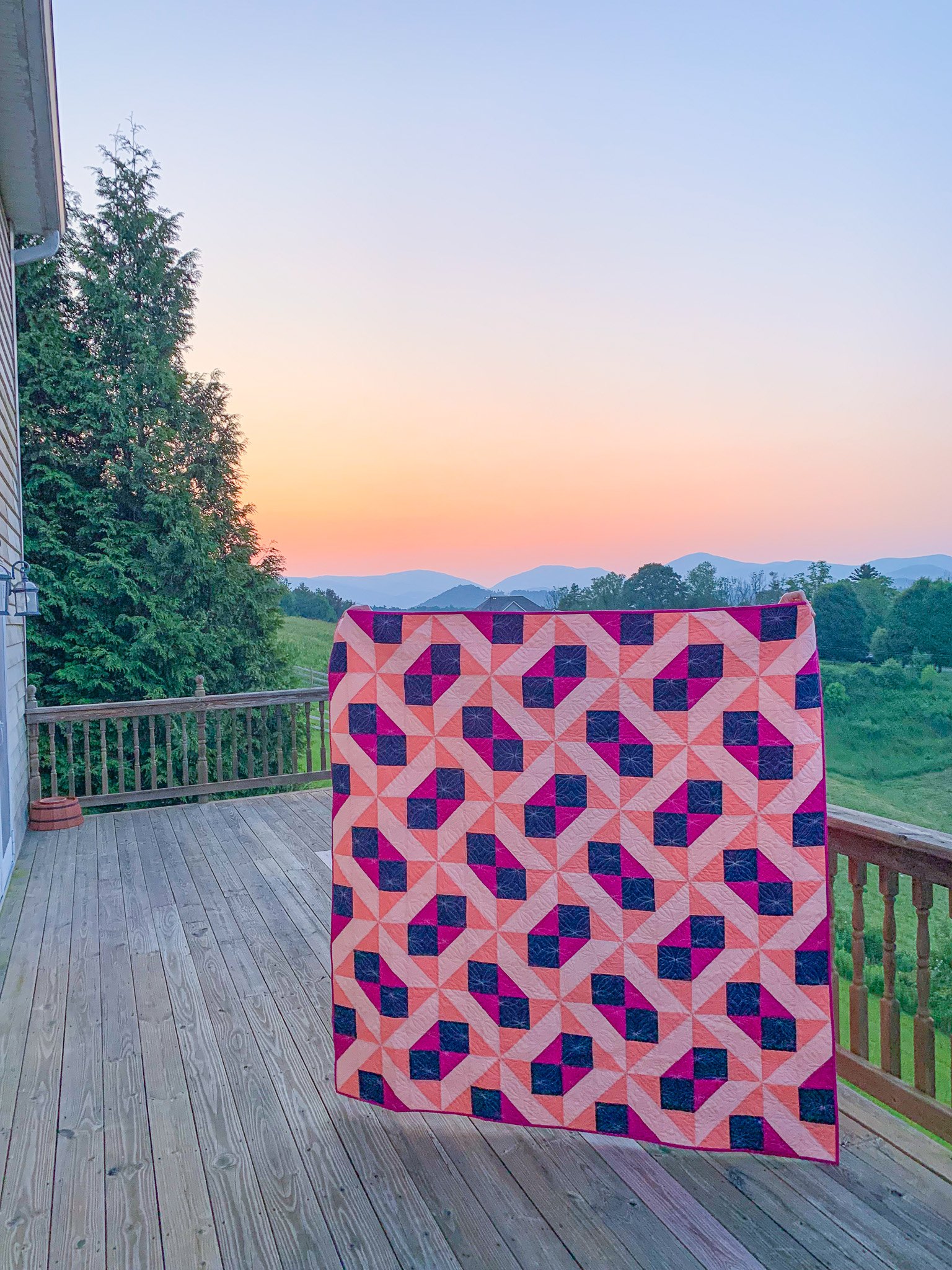
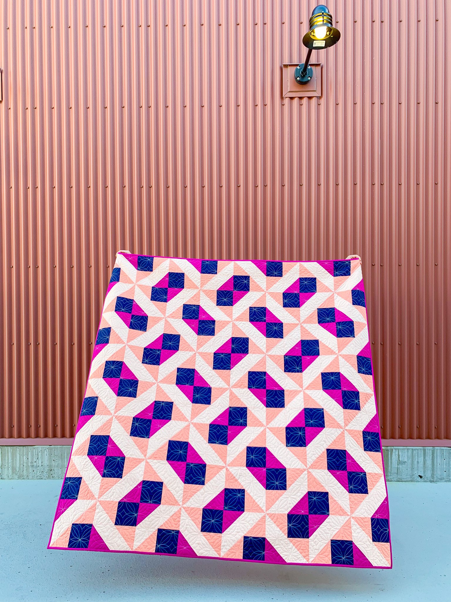
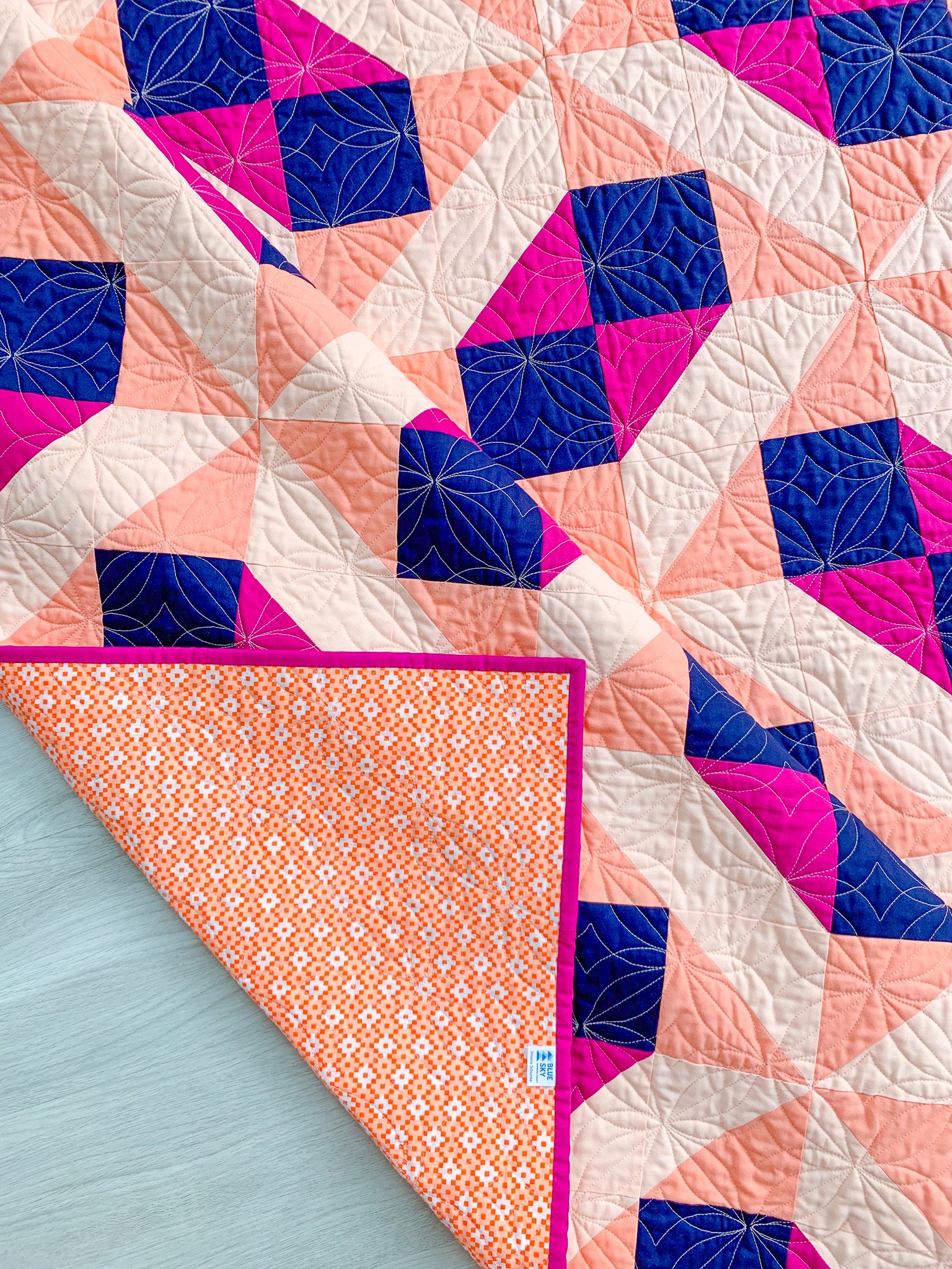
The cover quilt is the Throw size. The fabrics in the cover quilt are Kona Cotton Solids in Cerise, Creamsicle, Ice Peach, and Nautical. It was pieced and bound by me and quilted by Lilo Whitener-Fey / Trace Creek Quilting using a pale peach thread. The quilting pantograph is Twinkle Toes by Karlee Porter, and the backing is Paintbox Diamonds in Peach by Elizabeth Hartman.

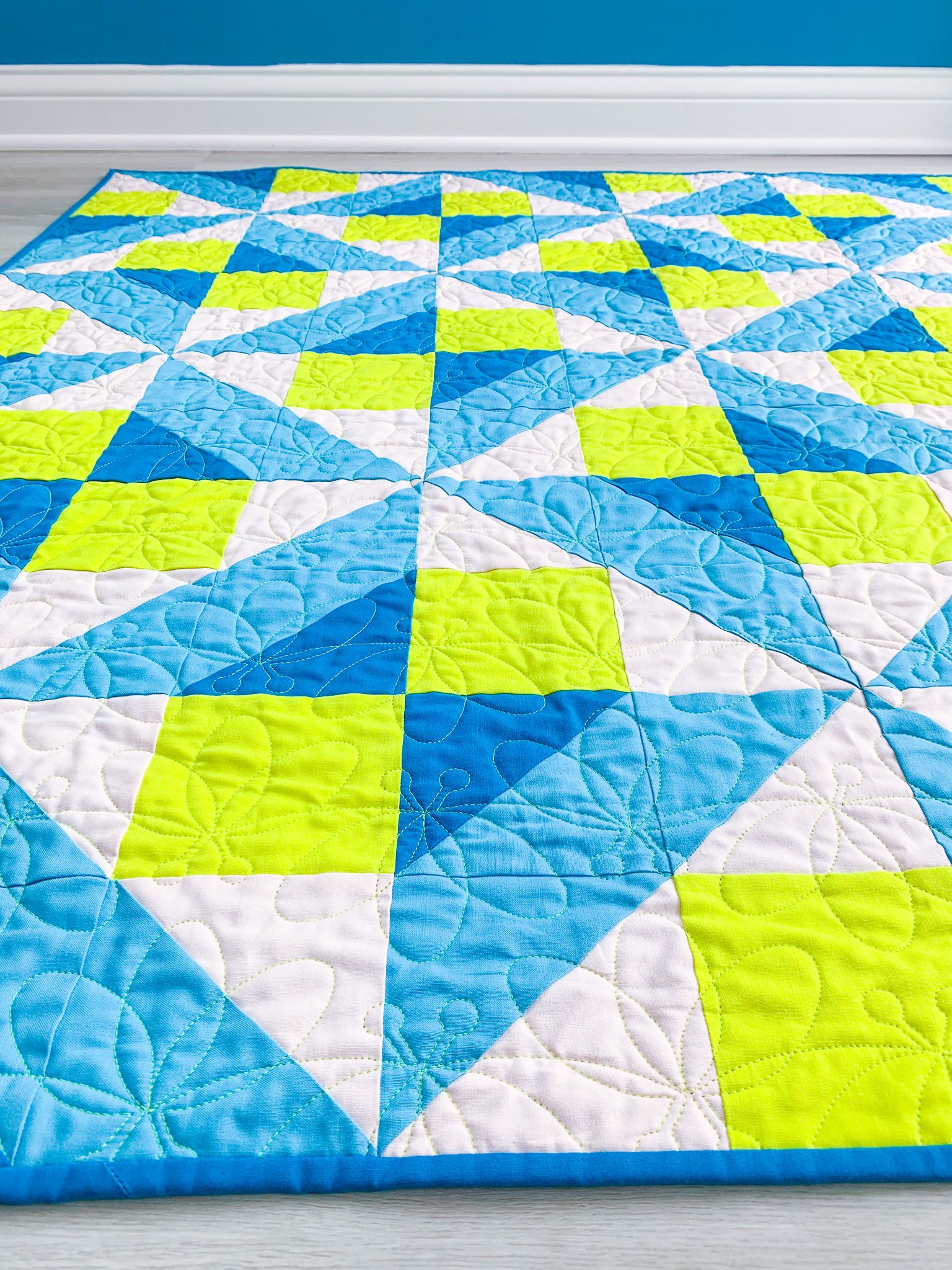
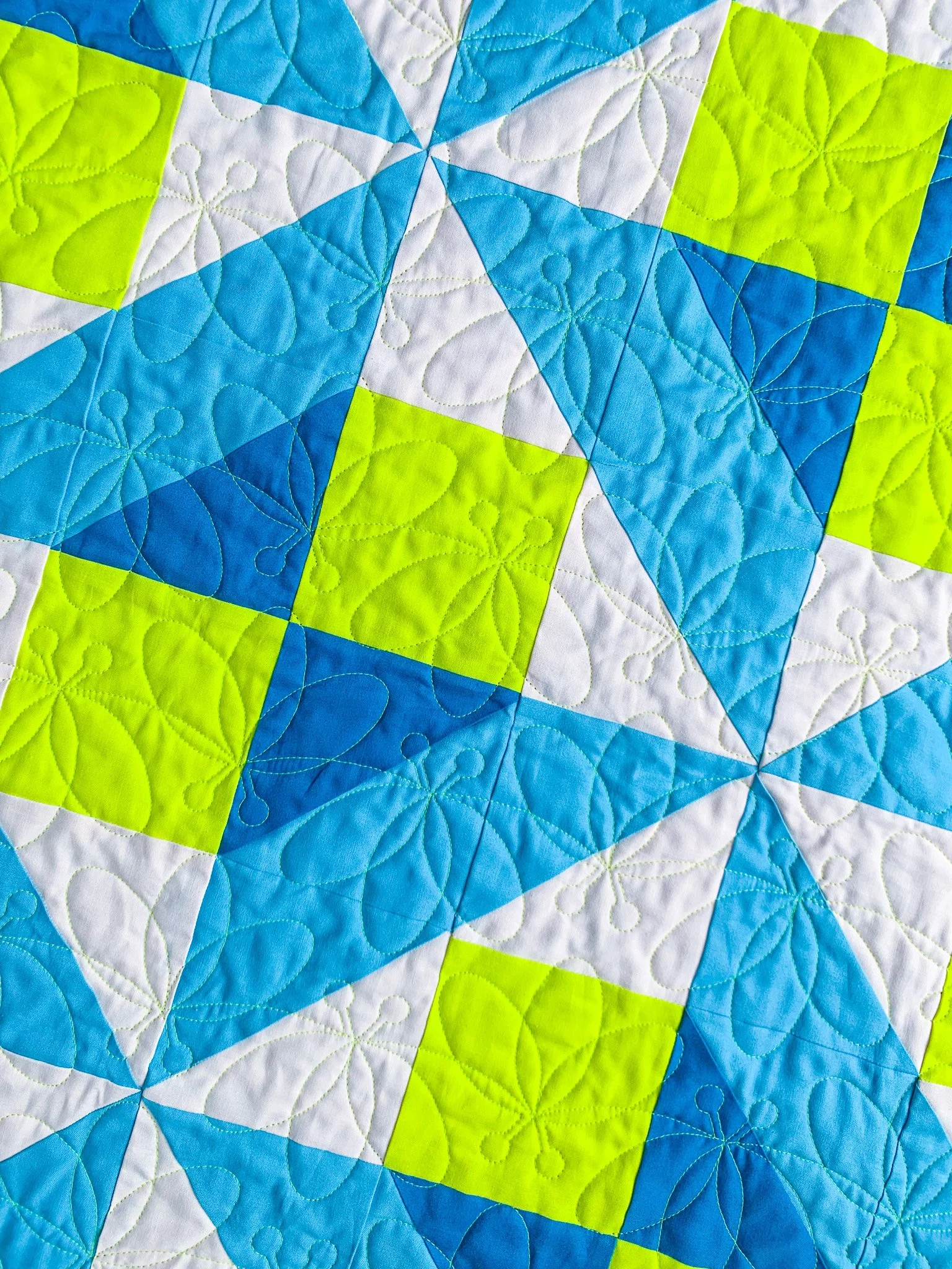
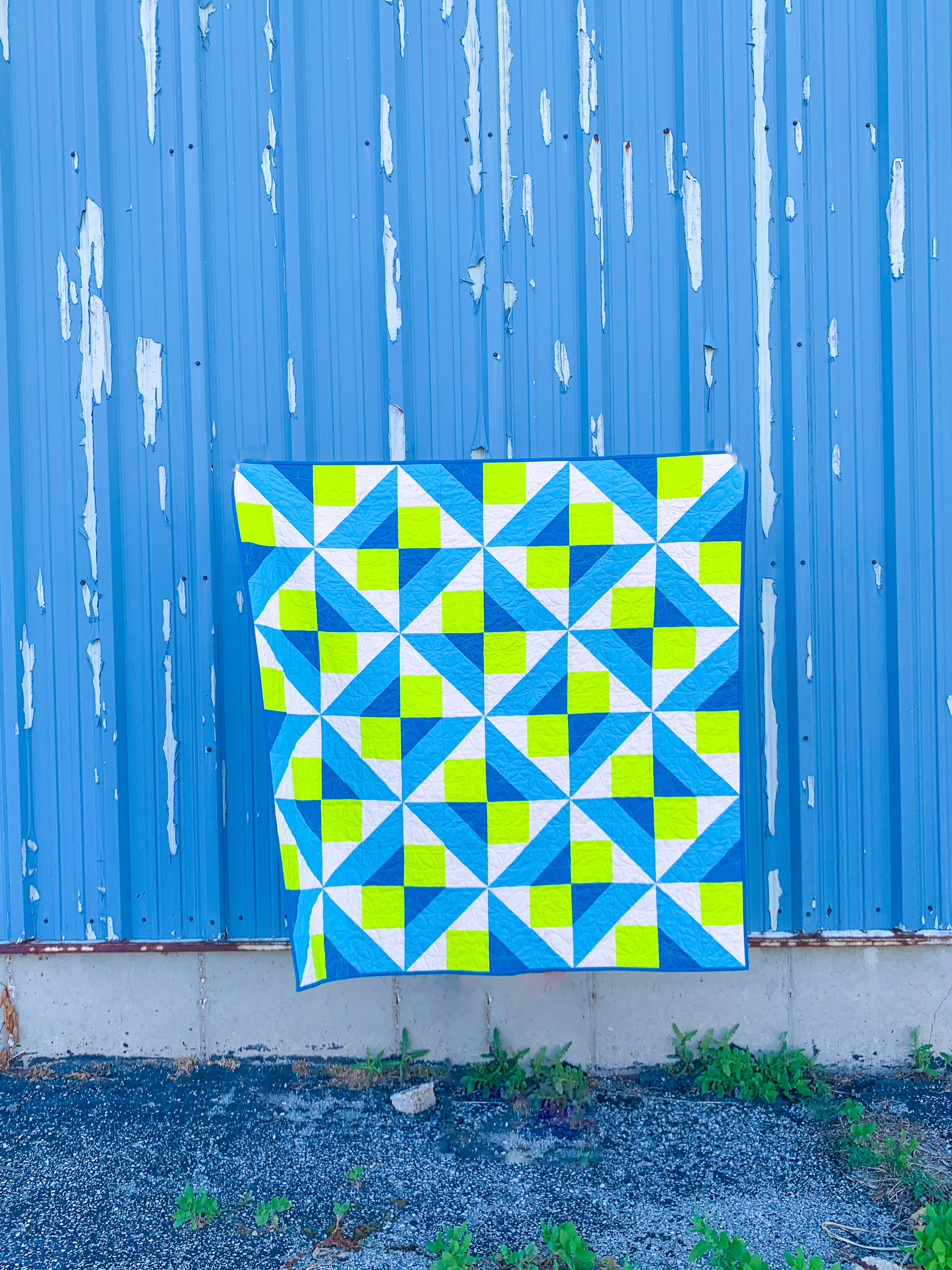
The fabrics in the lap sample quilt are Kona Cotton Solids in Shell, Seascape, Oasis, and Acid Lime. It was pieced by Christine Boyd, quilted by Lilo Whitener-Fey / Trace Creek Quilting using neon yellow thread, and bound by me. The quilting pantograph is Firefly by Crystal Smythe, and the backing is Domino Dot in Seascape by Violet Craft.
I’ll admit to being totally obsessed with everything about this version. It’s so bright and cheerful, and the color placement really shows off how different this design looks depending on how you place your dark and light colors. With this placement, the blues (Colors 2 and 3) really pop out to me, which (along with the colors themselves) gave the quilt a “firefly” feel, leading to the choice of quilting panto. In the original quilt, the navy and fuchsia (Colors 3 and 4) are the ones that really stand out, creating a whole different design emphasis.
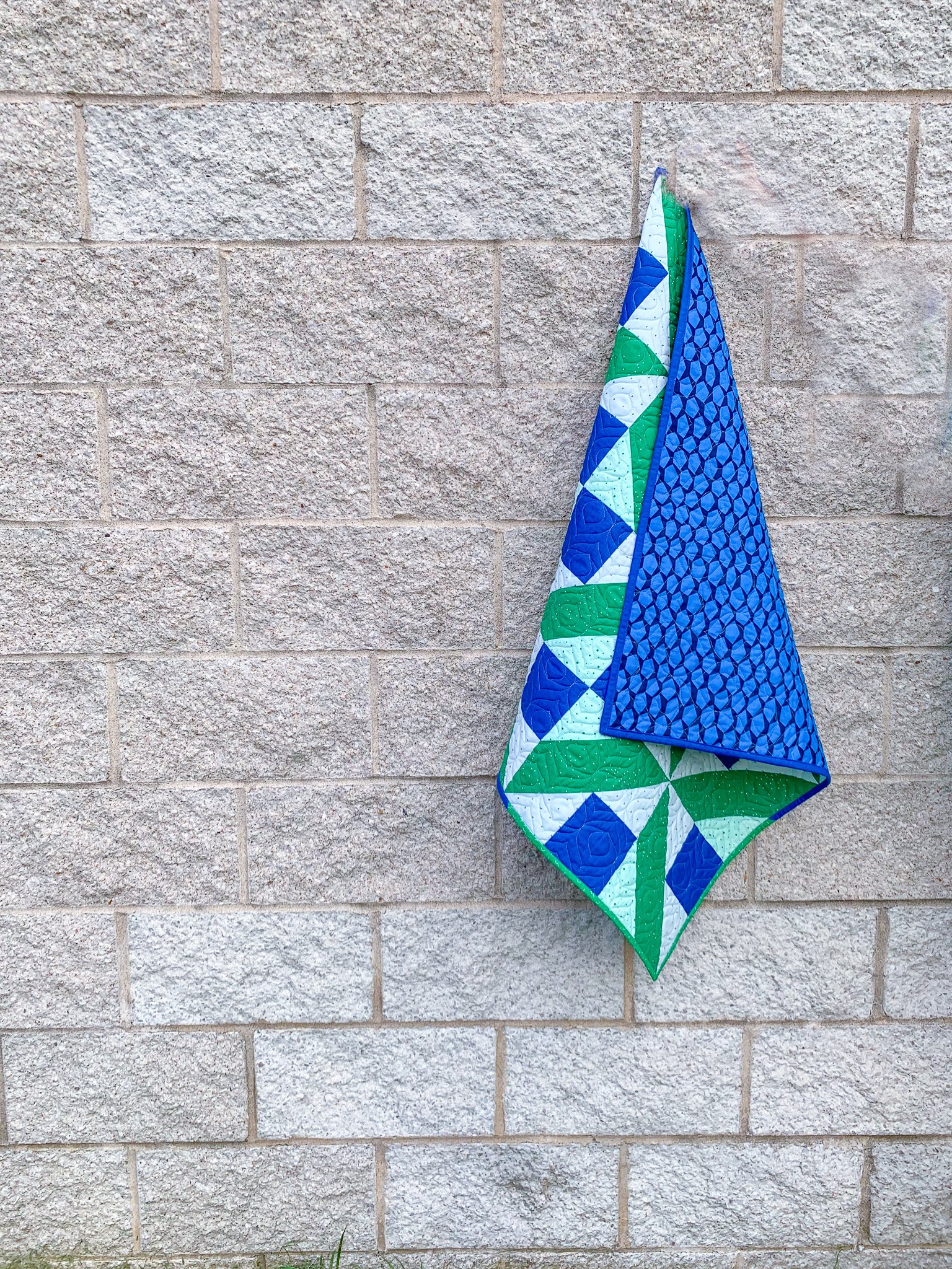
Finally, the baby sample quilt was pieced and bound by me using a variety of fabrics pulled from my stash (which is super easy to do with the small cuts required for the baby) and quilted by Lilo Whitener-Fey / Trace Creek Quilting using a light blue thread. The quilting pantograph is Onion Skin 2 by Melissa Kelley of Sew Shabby Quilting, and the backing is Scales in Astral (108"-wide size) by Elizabeth Hartman from her out-of-print Reef collection.
In many ways, I think this color placement reads as the most traditional. The use of the darker green as Color 2 really makes the pinwheel aspect of the design stand out, especially because the fabrics used for Colors 1 and 3 are so light. This is also the only sample in which I used prints, but they’re all very small scale, so they basically read as solids. I think this design is definitely most effective with solids or small-scale, non-directional prints.


With three sample quilts, I thought it might be fun to do three different types of binding. The baby quilt was bound by machine. When I do machine binding, I attach the binding to the front of the quilt, then wrap it around to the back and use Wonder Clips to hold it in place. Then, I use a stitch-in-the-ditch foot to stitch from the front of the quilt, right alongside the binding, catching it on the back. It takes some practice and accurate clipping/pinning, but I’m usually quite happy with the results. The first picture below shows what the bindings look like on the back of the quilt; the second picture below shows the front of the quilts, and you can just see the ditch stitching if you look closely, but for the most part, this method creates the look of hand-stitched binding from the front.
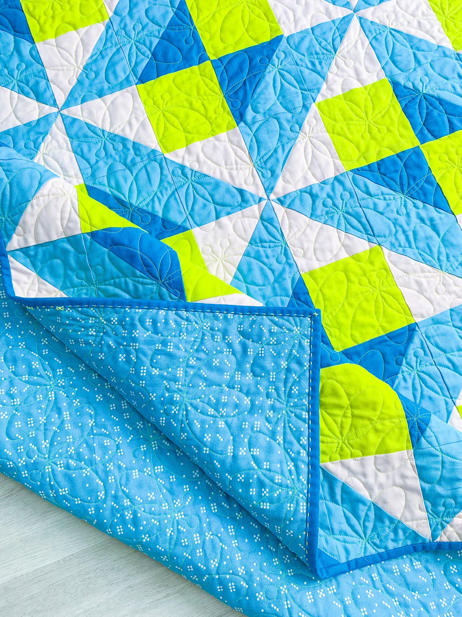
I bound both the lap and throw quilts by hand. For the lap quilt, I used big-stitch binding, my favorite and most commonly used technique. I just love the look of it and the character it adds to the binding and quilt. Plus, it’s another fun opportunity to add a pop of color, like the highlighter yellow sashiko thread I used for this quilt! For the throw quilt, I did a standard hidden whipstitch in a thread that matched the color of the binding fabric, so it basically disappears.

I’ve got a fun post coming up with a tutorial for the butterfly binding stitch I added to the lap-quilt sample, so stay tuned! In the meantime, pick up your copy of the Clayton pattern here to get started on your own version! I can’t wait to see what you make.